These are the most comfortable clothes that I wear. Well, not in the wintertime. But in the summertime, these are the most comfortable. I only have one pair of these shorts and one of these shirts but feel like I should just buy seven of each and wear nothing else. Well, of course, underwear. It is important to feel comfortable on a warm beautiful summer's day.
Showing posts with label Illustration. Show all posts
Wednesday, November 13, 2013
Illustration: Khaki Shorts and Polo Shirt
These are the most comfortable clothes that I wear. Well, not in the wintertime. But in the summertime, these are the most comfortable. I only have one pair of these shorts and one of these shirts but feel like I should just buy seven of each and wear nothing else. Well, of course, underwear. It is important to feel comfortable on a warm beautiful summer's day.
Sunday, April 15, 2012
Illustration: Gerald's Grandpa
I have been spending a lot of time lately finishing up some secondary illustrations for The Book of Bartholomew. These illustrations will be available throughout the stories of The Book of Bartholomew by clicking on words or areas of the stories. One of the one's I completed this weekend was of Gerald's grandfather. His grandfather does not have a name and is mentioned in the 2nd story, Gerald Teaches A Life Lesson.
What did I want grandpa to look like? I didn't know. I wanted him to be bald and have glasses. Other than that, I just started sketching. Once I completed the pencil sketch, I inked it in. Here is the completed inked drawing:
My thoughts were to create someone who was looking older. Unfortunately, in the story, grandpa is already dead. Characteristics of an older person, as represented in this drawing, include:
- large nose (I thought of Karl Maulden when I drew this - who is Karl Maulden, you ask. Oh grow up, will you!)
- wrinkled lips
- jowls
- large ears
- bags under the eyes
- sunken cheeks
- bald (not necessarily old, babies are bald)
- glasses (younger people have had lasik)
Using a transfer of the image, I painted the coloring on watercolor paper. Here is the painting that goes under the drawing:
What did I do here to emphasize the elderly gentleman?
- deep shadows under the nose and glasses
- redder color around the eye rims and nose bridge (nose bone is close to the skin here, causing reddish coloring)
I then put them both together and this is what I ended up with for Gerald's grandpa:
In the final, I toned down the black of the lines so the overall image would be softer. I like the image because there is a softness to him. How could Gerald's grandfather look like such a nice old man when Gerald is such a jackass? That's part of Bartholomew's world, people have a lot of stuff inside them. Even the bad people have a little good in them, and the good people have a little bad in them. I happen to think that Gerald's grandfather was nice to people around him but somewhat cruel to his family. Gerald got the short end of the stick and has been bitter ever since.
What did I want grandpa to look like? I didn't know. I wanted him to be bald and have glasses. Other than that, I just started sketching. Once I completed the pencil sketch, I inked it in. Here is the completed inked drawing:
My thoughts were to create someone who was looking older. Unfortunately, in the story, grandpa is already dead. Characteristics of an older person, as represented in this drawing, include:
- large nose (I thought of Karl Maulden when I drew this - who is Karl Maulden, you ask. Oh grow up, will you!)
- wrinkled lips
- jowls
- large ears
- bags under the eyes
- sunken cheeks
- bald (not necessarily old, babies are bald)
- glasses (younger people have had lasik)
Using a transfer of the image, I painted the coloring on watercolor paper. Here is the painting that goes under the drawing:
What did I do here to emphasize the elderly gentleman?
- deep shadows under the nose and glasses
- redder color around the eye rims and nose bridge (nose bone is close to the skin here, causing reddish coloring)
I then put them both together and this is what I ended up with for Gerald's grandpa:
In the final, I toned down the black of the lines so the overall image would be softer. I like the image because there is a softness to him. How could Gerald's grandfather look like such a nice old man when Gerald is such a jackass? That's part of Bartholomew's world, people have a lot of stuff inside them. Even the bad people have a little good in them, and the good people have a little bad in them. I happen to think that Gerald's grandfather was nice to people around him but somewhat cruel to his family. Gerald got the short end of the stick and has been bitter ever since.
Saturday, April 14, 2012
Illustration: Toxic Puffs Cereal
One of the fun things about the project The Book of Bartholomew is that I get to create some funny stuff. In one of the stories, Ned is eating Toxic-Puffs cereal. So I got to create this illustration of a box of Toxic-Puffs cereal. I was quite happy when it was completed, so I am sharing it with you here. Enjoy!
Tuesday, September 13, 2011
Illustration: Fat Pig BBQ Sauce logo
I recently created a pig image for the Fat Pig BBQ Sauce logo. Fat Pig BBQ Sauce is a very tasty sauce created by Brad and Michelle. Honestly, I've had some and it is very good. Well, they had a clip art pig on their label, but since they were a very small business, that worked fine. But now they were making another batch of sauce and asked if I would tweak their pig for them. Anyone who has read this blog knows I don't mind tweaking pigs. The image above is the first pig I created. One of the requirements was that the pig be wearing a chef's hat. The other was that the pig should be winking one eye. I liked this one.
Below you can find the final colored image I created for the logo. I am quite happy with it - he has some personality. The little larger hat looks much better, too. If Fat Pig BBQ Sauce ever takes off and you happen to come across it, try it. You won't be disappointed. Just don't call the pig Brittany!

I added the Fat Pig name so Brad and Michelle could see how the image might integrate with the text. Although they liked this pig head, they did not choose it. The fat pig below was the drawing they chose. They liked the curly tale and the smile. I okayed this sketch with them before adding color. The only change they wanted was a little larger hat.
I must digress here for a moment and share some more of the story. When looking to create a fat pig, I decided to google the term "fat pig." I did not have a real pig handy, so I wanted to look at a lot of images. I have to confess I was not expecting what I found. The first several images were of pig illustrations and some photos of large pigs. These gave way to images of Brittany Spears! The images were of her first comeback performance after her drug rehab. She was obviously not in the best "Brittany" shape, but was still nowhere near fat. Further down the page where images of obese women. Okay, Brittany is a celebrity and I expect people to be judgmental and catty toward celebrities, but it was just plain rude to include these other women. I guess I shouldn't be surprised -- but I was -- and insulted! Why weren't there any images of obese men. It is just incredibly unfair and insulting to these women. I digressed and now I will unigress.Below you can find the final colored image I created for the logo. I am quite happy with it - he has some personality. The little larger hat looks much better, too. If Fat Pig BBQ Sauce ever takes off and you happen to come across it, try it. You won't be disappointed. Just don't call the pig Brittany!
Monday, March 7, 2011
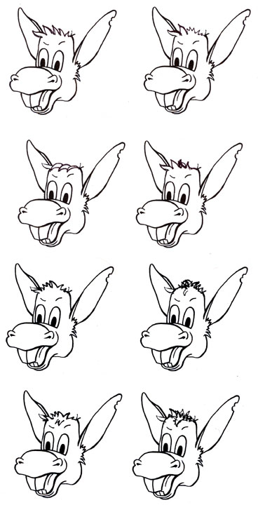
Illustration: Donkey Burger Logo Trials
I recently was creating a logo for Donkey Burger, the fast-food restaurant in The Book of Bartholomew. A donkey was the first order of business. I needed to create a comical donkey head. Below are some trials of different donkey heads. You can see that I had a pretty good beginning and only tweaked hair, mouth, ears and eyes from this point. My first go is the upper left image in the group of eight. I didn't like the hair, so I printed out several incomplete donkey heads and then tried different hair styles.
After I settled on a hair style, I wasn't happy with the ears. I had one thin ear and one big ear. They didn't match. At first I copied and pasted the thin ear to the other side of his head, so they matched. I didn't quite like this. Then I created a big ear for the front, to match the one in the back. I liked this better.
Now that I had the donkey head like I wanted it (although I still want to change the eyes slightly) I made it into an official Donkey Burger logo by adding the name, some circles and stars and the tagline. I like "Meat with a Kick," which is safer than the other choice of "Eat My Ass."
This logo will appear on the next published story in The Book of Bartholomew. The story is titled "Lunch Rap," and will be published on March 18 at http://www.bookofbartholomew.com/
I hope you enjoyed this. Keep using your Donkey...ooops!... I mean, your Artist's Brain.
After I settled on a hair style, I wasn't happy with the ears. I had one thin ear and one big ear. They didn't match. At first I copied and pasted the thin ear to the other side of his head, so they matched. I didn't quite like this. Then I created a big ear for the front, to match the one in the back. I liked this better.
Now that I had the donkey head like I wanted it (although I still want to change the eyes slightly) I made it into an official Donkey Burger logo by adding the name, some circles and stars and the tagline. I like "Meat with a Kick," which is safer than the other choice of "Eat My Ass."
This logo will appear on the next published story in The Book of Bartholomew. The story is titled "Lunch Rap," and will be published on March 18 at http://www.bookofbartholomew.com/
I hope you enjoyed this. Keep using your Donkey...ooops!... I mean, your Artist's Brain.
Saturday, September 11, 2010
Illustration: Book Cover - Bartholomew Makes a Decision
Here are images showing the progression for creating the cover for the first tale of The Book of Bartholomew. The first two sketches are my first ideas of what I wanted to paint: a plate of corn, green beans and kale. The first is very rough and was only about 1.25" square. The second image represents another plate of food with the words "KNOCK, KNOCK" on the cover. This is because Bartholomew is interrupted during his meal by a knock at the door. All Bartholomew wants to do is find some decent food and once he sits down to eat he is interrupted by the phone and the door.
Then it was time to do some research. This meant enjoying a few meals of corn, geen beans and kale. I cooked the kale once and the other time my girlfriend cooked it. Hers was much better. We cooked the food and then I went to work rearranging it on the plate to somehow match what I wanted to do. I did not find my final composition, but it was fun and informative for the final painting. The food was good. I wish the green beans were from my garden. Today I could pick them and use them, but when I painted this picture beans were not in season.
I used these images to layout the composition of the painting and made the first layer of paint on canvas. From there I built up the surfaces and colors to create a finished painting of a plate of kale, corn and green beans. The cooked kale was the hardest to paint. It was hard to get a focused picture of it as its edges are rather soft and difficult to pick out.
After completing the painting, I took the image to Photoshop and added the words KNOCK KNOCK and the title. This was a fun stage - turning a painting into a book cover
The next step was to create a background for the inside text pages of the story. Continuing with a food theme, I created drawings of forks and spoons. These images line the text pages and are faded behind the text. This was a very fun story to illustrate. I like the idea of not showing Bartholomew or Gerald, but letting the reader develop their own physical image of the characters.
Sunday, December 13, 2009
Claire: book final
Here are the final pages to the mini-book Claire, from The Book of Bartholomew I am producing. I had to partner the pages in an odd order so when I print them out they will line up in the right order. Claire is the sixth book in the first volume of The Book of Bartholomew. I will be working with a few other local artists who will illustrate the stories with me. This process will begin just after the new year and I hope to have the final book complete by October of 2010. We will see how this goes. It looks like a busy 2010.


Thursday, December 10, 2009
Illustration: Book Pages
Here are images I have created from my Dominique chicken painting and the chicken illustration featured in the last entry. These images will be the pages on which the story of Claire will be written. The complete illustration will act as a centerfold to the small book. The painting is now the cover of the book. I will share the finished pages with the story on them when I have it done. Hopefully that will be in the next day or two.


Tuesday, December 8, 2009
Illustration: Chickens Complete

This is the completed pen and ink illustration for the story Claire from The Book of Bartholomew. To see the original sketch click here.
Wednesday, December 2, 2009
Illustration: Claire's Chickens

Here are some images of an initial sketch for a chicken illustration I am making for my story about Claire.

The story of Claire is from a series of stories I am writing and illustrating from The Book of Bartholomew. I hope to have the first stage of this book completed by October 2010 when I have a solo exhibit at Homewood Studios.

I will share more as it develops.

Subscribe to:
Posts (Atom)