I sat down with Matt Wells at the Black Forest Inn to talk about his illustrations for the story Gerald Teaches a Life Lesson in The Book of Bartholomew. Here it is:

Thursday, October 11, 2012
Thursday, April 26, 2012
Studio Renovations - Custom Wood Flat File, part 2
Well, last entry saw my flat file looking pretty good, but not complete.
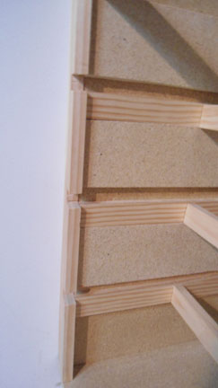
 Here is what it looked like. One thing I did not talk about last entry was the vertical boards I added to the front on the sides. These two boards do three things. First, they hide the ends of the flat files' sides. Second, they are notched and guide the drawers through to the glides. Third, they were cut to butt up against the walls and cover the gaps between the sides of the flat file and the walls surrounding it. Here is another image of one of these boards where you can see the notches:
 I had to cut the notches with a scroll saw, which is what I used for all the cutting. I often clamped a four foot level to the particleboard and plywood as a guide to to keep my cuts straight. The notches here were done by hand and end up being a little rough looking, although they look fine here.
Next, I put fronts on the drawers that will act as drawer pulls and will also keep items from slipping out of the drawers. Here is an image of two drawers leaning against a wall with the fronts on them.
 The fronts are made of 3/8" x 2" smooth slats. I sanded the front edges to a gentle rounding. I glued these fronts on and then nailed them, making sure they were centered on the drawer. The fronts also extend beyond the sides of the drawers a little bit. This will end up covering my rough notches I mentioned earlier.
Here is an image of the flat file with the drawers installed.

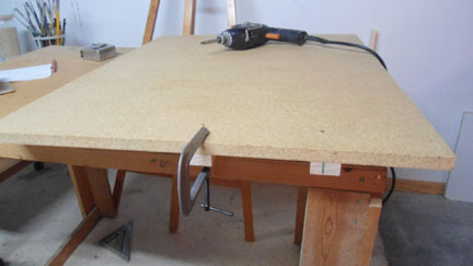
Next, I had to create the top. For this I used some sanded plywood. But the walls surrounding the flat file are not square. I wish I was a better carpenter, but there you go. So how was I going to cut a top that would fit snug without big gaps between the top and the walls around it? To do this, I used drywall. Or at least, I used a piece of drywall with two original edges that still had the 90 degree corner. I laid one straight edge against the back wall and could then see, and measure, any gaps.
 Here you can see that I have a 3/4" gap to account for. The other side actually lined up pretty well, but there was a little bow to the wall. Once I carefully measured these gaps and bows, I marked the plywood top and cut it. The first fit was pretty good. I had to trim a little off of the side with the bow, but it was easy and I was very happy with the fit. I nailed the top to the frame and screwed the middle of the top to the uppermost supports underneath. I finished by putting a piece of trim along the front of the top to hide the edge of the plywood and to have a rounded edge. And here is what it looks like.

I ended up putting one more slat across the bottom shelf to hide the edge of the particle board and to make it match the fronts of the drawers. The top of the flat file extends forward from the drawers about 5" so that I can sit on a stool and draw on the top. It is quite comfortable. The only additional thing I might do is wax the glides. The drawers pull out fine, but they are heavy and a little wax would help keep them gliding smoothly for years to come. Here is a picture with one of the drawers open.

And here is my helper: Delilah was in my studio with me most of the time while I was making this flat file. Every time I would cut a piece of wood, she would come over and pick up the scrap, go to a carpeted part of the studio, lay down and chew it to splinters. My floor was covered with wood shavings - from her.

I hope you enjoyed this little how-to on making a flat file. If you have any questions, feel free to ask.

Next, I put fronts on the drawers that will act as drawer pulls and will also keep items from slipping out of the drawers. Here is an image of two drawers leaning against a wall with the fronts on them.

Here is an image of the flat file with the drawers installed.

Next, I had to create the top. For this I used some sanded plywood. But the walls surrounding the flat file are not square. I wish I was a better carpenter, but there you go. So how was I going to cut a top that would fit snug without big gaps between the top and the walls around it? To do this, I used drywall. Or at least, I used a piece of drywall with two original edges that still had the 90 degree corner. I laid one straight edge against the back wall and could then see, and measure, any gaps.


I ended up putting one more slat across the bottom shelf to hide the edge of the particle board and to make it match the fronts of the drawers. The top of the flat file extends forward from the drawers about 5" so that I can sit on a stool and draw on the top. It is quite comfortable. The only additional thing I might do is wax the glides. The drawers pull out fine, but they are heavy and a little wax would help keep them gliding smoothly for years to come. Here is a picture with one of the drawers open.

And here is my helper: Delilah was in my studio with me most of the time while I was making this flat file. Every time I would cut a piece of wood, she would come over and pick up the scrap, go to a carpeted part of the studio, lay down and chew it to splinters. My floor was covered with wood shavings - from her.

I hope you enjoyed this little how-to on making a flat file. If you have any questions, feel free to ask.
Monday, April 23, 2012
Studio Renovations - Custom Wood Flat File, part 1
I have been doing some more renovations in my studio. I have been building a custom flat file that will fill an area at one end of my studio and also serve as a drawing table. I began with measuring the space so I could sketch a flat file plan big enough to hold pieces of paper 30" x 40".
 Here is my sketch for figuring out how much lumber I was going to have to buy. I based my design on a custom flat file I saw at Wet Paint art store. My flat file is going to be 32.75" x 45" x 27". I already have a base built on the floor so the total height of the finished flat file will be at 32".
 I first cut the sides and back to fit on the base I had built previously. They are made of particle board and I sealed them with some polyurethane so they will not absorb moisture and warp. I next built runners, or drawer glides, that would be screwed to the sides. I turned the sides over and clamped and screwed the drawer glides in from behind so screws wouldn't show.

There are three drawer glides on each side and they had to line up with each other so when the drawers are installed they will not be out of alignment or crooked. When completed, there will be three drawers I can pull out to access the paper and a fourth area at the bottom that will act like a shelf/storage area. Once the drawer glides were attached, I assembled the sides and back panels.

I assembled most of the flat file outside of its final position so that I could screw through the side walls into the glides and supports. Here are three of the six supports that will keep the sides and back in alignment and also support some of the weight of the drawers. I placed the first set of supports 8" from the front and the second 8" from the back. Here's what this stage looks like completed and moved into place.

Below is a view of the glides. I needed to add some wood to the sides in order to have a smaller area for the drawer to glide in. As is, the drawers could easily angle up once they are pulled out more than halfway. So I added the wood on the sides.


Next I cut the drawers to size, 32.75" x 44.75". I slipped the drawers into place to help me "square" the flat file. The flat file was sitting unattached on the base, but once I squared it with the drawers, I secured it with screws through the painting storage area to the left and also into the base. Here is what it looks like with the unfinished drawers in place.

I will show you how I finished the flat file in my next entry, where I make pulls on the drawers, create a filler board to hide the gap between the file and the walls and put on a top.


There are three drawer glides on each side and they had to line up with each other so when the drawers are installed they will not be out of alignment or crooked. When completed, there will be three drawers I can pull out to access the paper and a fourth area at the bottom that will act like a shelf/storage area. Once the drawer glides were attached, I assembled the sides and back panels.
I assembled most of the flat file outside of its final position so that I could screw through the side walls into the glides and supports. Here are three of the six supports that will keep the sides and back in alignment and also support some of the weight of the drawers. I placed the first set of supports 8" from the front and the second 8" from the back. Here's what this stage looks like completed and moved into place.

Below is a view of the glides. I needed to add some wood to the sides in order to have a smaller area for the drawer to glide in. As is, the drawers could easily angle up once they are pulled out more than halfway. So I added the wood on the sides.


Next I cut the drawers to size, 32.75" x 44.75". I slipped the drawers into place to help me "square" the flat file. The flat file was sitting unattached on the base, but once I squared it with the drawers, I secured it with screws through the painting storage area to the left and also into the base. Here is what it looks like with the unfinished drawers in place.

I will show you how I finished the flat file in my next entry, where I make pulls on the drawers, create a filler board to hide the gap between the file and the walls and put on a top.
Sunday, April 15, 2012
Illustration: Gerald's Grandpa
I have been spending a lot of time lately finishing up some secondary illustrations for The Book of Bartholomew. These illustrations will be available throughout the stories of The Book of Bartholomew by clicking on words or areas of the stories. One of the one's I completed this weekend was of Gerald's grandfather. His grandfather does not have a name and is mentioned in the 2nd story, Gerald Teaches A Life Lesson.
What did I want grandpa to look like? I didn't know. I wanted him to be bald and have glasses. Other than that, I just started sketching. Once I completed the pencil sketch, I inked it in. Here is the completed inked drawing:
 My thoughts were to create someone who was looking older. Unfortunately, in the story, grandpa is already dead. Characteristics of an older person, as represented in this drawing, include:
- large nose (I thought of Karl Maulden when I drew this - who is Karl Maulden, you ask. Oh grow up, will you!)
- wrinkled lips
- jowls
- large ears
- bags under the eyes
- sunken cheeks
- bald (not necessarily old, babies are bald)
- glasses (younger people have had lasik)
Using a transfer of the image, I painted the coloring on watercolor paper. Here is the painting that goes under the drawing:
 What did I do here to emphasize the elderly gentleman?
- deep shadows under the nose and glasses
- redder color around the eye rims and nose bridge (nose bone is close to the skin here, causing reddish coloring)
I then put them both together and this is what I ended up with for Gerald's grandpa:
 In the final, I toned down the black of the lines so the overall image would be softer. I like the image because there is a softness to him. How could Gerald's grandfather look like such a nice old man when Gerald is such a jackass? That's part of Bartholomew's world, people have a lot of stuff inside them. Even the bad people have a little good in them, and the good people have a little bad in them. I happen to think that Gerald's grandfather was nice to people around him but somewhat cruel to his family. Gerald got the short end of the stick and has been bitter ever since.
What did I want grandpa to look like? I didn't know. I wanted him to be bald and have glasses. Other than that, I just started sketching. Once I completed the pencil sketch, I inked it in. Here is the completed inked drawing:

- large nose (I thought of Karl Maulden when I drew this - who is Karl Maulden, you ask. Oh grow up, will you!)
- wrinkled lips
- jowls
- large ears
- bags under the eyes
- sunken cheeks
- bald (not necessarily old, babies are bald)
- glasses (younger people have had lasik)
Using a transfer of the image, I painted the coloring on watercolor paper. Here is the painting that goes under the drawing:

- deep shadows under the nose and glasses
- redder color around the eye rims and nose bridge (nose bone is close to the skin here, causing reddish coloring)
I then put them both together and this is what I ended up with for Gerald's grandpa:

Saturday, April 14, 2012
Illustration: Toxic Puffs Cereal
One of the fun things about the project The Book of Bartholomew is that I get to create some funny stuff. In one of the stories, Ned is eating Toxic-Puffs cereal. So I got to create this illustration of a box of Toxic-Puffs cereal. I was quite happy when it was completed, so I am sharing it with you here. Enjoy!


Thursday, March 29, 2012
Watercolor: Liatris Painting - Part 1

Liatris, like many flowers, are a difficult color to match unless you start out with the right colors. I will be discussing that, as well as how to paint depth into a composition. This is a complex composition in terms of all the overlapping leaves and the variety of textures. The transition on the bloom stalk will be most interesting, as the blooms go from open to hardly being buds.
Tuesday, February 28, 2012
Starting an Art Center
By the end of March , I am going to submit a proposal to lease this building as an art center And I would like your input! You can join this discussion on this blog or at my Facebook Page.


Here is some background and some of my ideas so far:
The building is located in the Hamline-Midway neighborhood in Saint Paul (my neighborhood). It is a WPA building, built in 1938 and designed by Clarence "Cap" Wigington. Wigington was the nation's first black municipal architect, serving as senior designer for the City of Saint Paul, Minnesota's architectural office for 34 years when the city had an ambitious building program. It is big enough to have two full size classrooms and one room for a gallery/event space. It also has a small office space, 2 bathrooms and limited storage (and a flagpole on top).
Here are some of the questions I would like to address through the activities of this art center:
- What media can be taught best in this small site with limited storage?
- How and what can this center give to the artists who live in this immediate neighborhood?
- How and what can this center give to the neighborhood around it?
- What can the community give through this art center?
- How can individuals be taught to create beautiful artwork they care about?
If I acquire the building, it will be too late in the spring to create a full slate of classes for the summer. So, this summer will be about trying different types of programs, getting feedback from the community and developing the fall schedule. At this point, I am not too concerned with financials. That will come later.
I think that is where I will stop with the questions and thoughts, but you could add comments about any aspect of starting a new art center.
Who am I to start an art center? In 1994, I started the education department at the Como Park Zoo and Conservatory and coordinated a fine art and botanical art program there for nine years. The arts programming was very successful. Since then, I have helped to create a city-wide beautification program called Blooming Saint Paul. I have taught undergraduate art classes at Brooklyn College, Brooklyn, NY and at Bethel College, Saint Paul, MN. I have taught community education art classes and workshops for the last 18 years. To learn more and see my work, please check my website: www.markgranlund.com.
Thank you for posting your comments and thoughts here or at my Facebook Page.
Sunday, February 26, 2012
When I Am Not Painting I'm Being Grandiose
I have not felt as if I have been doing much artwork lately, although that is not true. I have been doing much computer work finishing up the layout on several Book of Bartholomew stories. I have also been working slowly on the city council scene for one of the stories. Below you can see the inked version. I am currently painting the image with watercolors.

One thing that has been preoccupying me is that soon I will pursue a building to begin a small art center in my neighborhood. I have been talking with many people about this endeavor and trying to develop a mission for the center and configure what programming would take place. I have decided I want more people's input, so that will be my next post. Stay tuned.
Sometimes I loose sight of what is important. The training I received in school, and the general paradigm of the era I grew up in, was that artists cranked out work to be sold in galleries. If you weren't producing paintings you weren't an artist - you were a hobbiest. It is hard to shed that old paradigm which is no longer true. Technology and the general understanding that being a creative artist simply means creating something and putting it out there for anyone to see. I hope this change has come about because artists have figured that out that there are far more artists than the gallery world can provide for. It is not up to the gallery owners and collectors to decide who is and who is not an artist. It is no longer a matter of sitting in your studio producing as much as you can and, if it doesn't work, then getting a real job.
The other paradigm for artists back then was to become an art professor at a college and then have summers, weekends and a little help from students to get your work done. Today, with the technology we have, the paradigms has shifted. There are more avenues for expression and more venues for exposure. So what am I doing when I am not making a painting to be sold at a gallery? I'm busy making the world I want to live in. A creative world where people are helped with their life decisions. A world where artists collaborate with each other because of the energy and potential for satisfying work. A life where the walls between disciplines are breaking down. A life where the walls between people are crumbling. Yes, it sounds grandiose, and it is - but it's not. It is simply making a decision every day to do something creative and to reach out while doing it. This is against the grain and counter to society and most peoples lives. That is the only reason it seems grandiose, because you can't be grandiose unless you are contrary to the norm. Anything contrary to the norm will seem grandiose - or grotesque. I guess I am choosing not to seem grotesque.
So what am I doing when I am not painting? I am still here making, working and being my grandiose self.
Saturday, February 18, 2012
Sketchbooks and Journals


Personal journaling is something I no longer do. As I have looked back over the years at my journals, I find the same drivel repeated every few years. Obviously, I was not getting anywhere with it. Like my art, I prefer to spend my time in the final experience of living, not in the sketching out of what I might think about my experience. I find responding to what is around me far more interesting. But that's me.
Wednesday, January 25, 2012
Retouching Paintings
Part of renovating my studio has been going through old paintings and deciding what to keep and what to paint over. It is interesting going back to old paintings after not seeing them for awhile. Some, obviously should be painted over. Others, because of my overly critical eye when I paint, look better than I remember them. There was a series of small canvases I created last year where I timed myself. When I reached my time limit I stopped, no matter what. Some of these small paintings ended up looking great. Others needed a little more time to look better. Here are two examples.
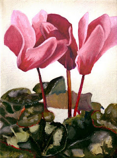
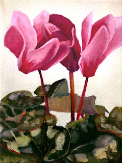
The first version of this cyclamen painting was a bit flat in the flowers and, although not as obvious here, was a bit more orangey than fuscia pink. I painted over the flowers in the first version of the painting with a bright pink glaze. In the shadowy dark areas I mixed in a little permanent blue to the bright pink glaze. By glazing, I didn't have to re-draw any lines or shapes. I simply changed the color. I was happy with the leaves and left those alone.


In this landscape of two islands up north, well, the first version is so bad I even misnamed it. I called it Hawk Island, when in fact it is Crow Island. The painting felt clunky and needed just a little more time to refine, especially the water. So, I went over the entire painting with glazes and some thicker paint here or there. The two biggest changes were to create more contrast in the trees and less contrast in the water. I repainted almost all of the trees and the hillside behind with lighter and darker tones than were there. I also punched up the highlights on the rocks. The end result being that you now see through the tree trunks on the closest island to the furthest island. I also made the leaves on the closer trees more autumnal in order to create even more contrast between them and the island behind.
Then I attacked the water with a scumble of very light blue-grey over the existing wave patterns. This creates more of a surface on the water instead of a pattern. This also creates more distance - as it makes the surface of the water lay down and feel more horizontal.
I never used to go back into paintings once they are completed. But I find it fun when I know that just a few more minutes of tweaking will make a great improvement.
Wednesday, January 11, 2012
Oil Painting: Stir Fry Painting

Media: Oil Paint on Canvas
Size: 18" x 24" x 1.5"
This is the completed oil painting from two posts ago. Amy Sippl cooked the meal and I made a painting of it as an illustration for The Book of Bartholomew. To see an early stage of this painting check out my previous post here on The Artist's Brain blog. This was a fun painting to create - a lot of small detail which was challenging, yet at the same time, it didn't take long to paint any one thing. I think the hardest part were the handles, they project out from the wok on metal rods at odd angles. At first the handles looked curved and striped instead of like smooth wood.
Saturday, January 7, 2012
Painting Finishes - Cold Wax


Non-human? Oh, he's off his rocker.
I recently have come across, thanks to recommendations from the staff at Wet Paint, cold wax medium.

 You can see on this next painting the wax that I have rubbed on. It is a bit thick here. It should be rubbed on thin without any ridges showing. Rubbing in circles works best. Let it sit for one day. The next day, rub it again with a lint-free clothe to buff the wax. It is just like waxing your car. When you are buffing the wax, the microscopic platelets of wax are being flattened to overlap each other forming a protective skin. If you don't buff, the painting still has some protection, but not as good as when the overlapping platelets form a skin.
 Overall, the wax creates a consistent satin surface to the painting that "feels" more a part of the painting than a varnish. It smooths out inconsistencies in the shininess of the painting surface. In this picture, on the left hand side of the image, you can see the shininess of a spray-on varnish. On the far right of the painting, I have rubbed on some cold wax medium. You can see the difference in shininess.
Also, wax can be applied to the surface of an oil painting as soon as the paint has dried to the touch. Varnish should not be added to an oil painting until the paint has completely cured months later. Wax still breathes and allows the paint to cure. I am very happy with the wax and will continue to use it.
Subscribe to:
Posts (Atom)